What makes a good interface?
2015-09-15
In this post we begin to tackle the question: What makes a good interface? We do this in the context of Netpowder and by using a specific example with before/after screenshots.
Last week I turned Netpowder from a proof of concept to automating the depolyment of around 15 satellites. The details involved a lot of shell scripting and setting up Jails on FreeBSD using iocage. This if far from perfect but it’s good enough for now - I can re-generated a satellite in about 30 seconds, if need be. It’s time to move on to more pressing matters: the interface.
I still don’t know what Netpowder is or what it will be in a few months from now, but I do know that it’s bad in multiple respects. The biggest bottleneck right now is in terms of usability - once you have access to it, then what do you do? How do you use and discover the interface? This will be the focus for me these coming weeks, along with bugfixes and helping onboard trial users.
There are so many directions to go in in terms of interface - should we try to move towards no shell, make the shell better, provide live feedback, provide integration with git, represent files visually, etc. Where do you even begin? They all sound interesting and useful, but they also conflict with each other in what you are optimizing for.
So what do we do? One way is to begin by doing something simple and obvious: making what we have now suck less. That’s at least a step in the right direction - making a better interface, for whatever Netpowder turns out to be - so let’s focus on that.
A bad welcome
Let’s look at the welcome experience from a user’s point of view.
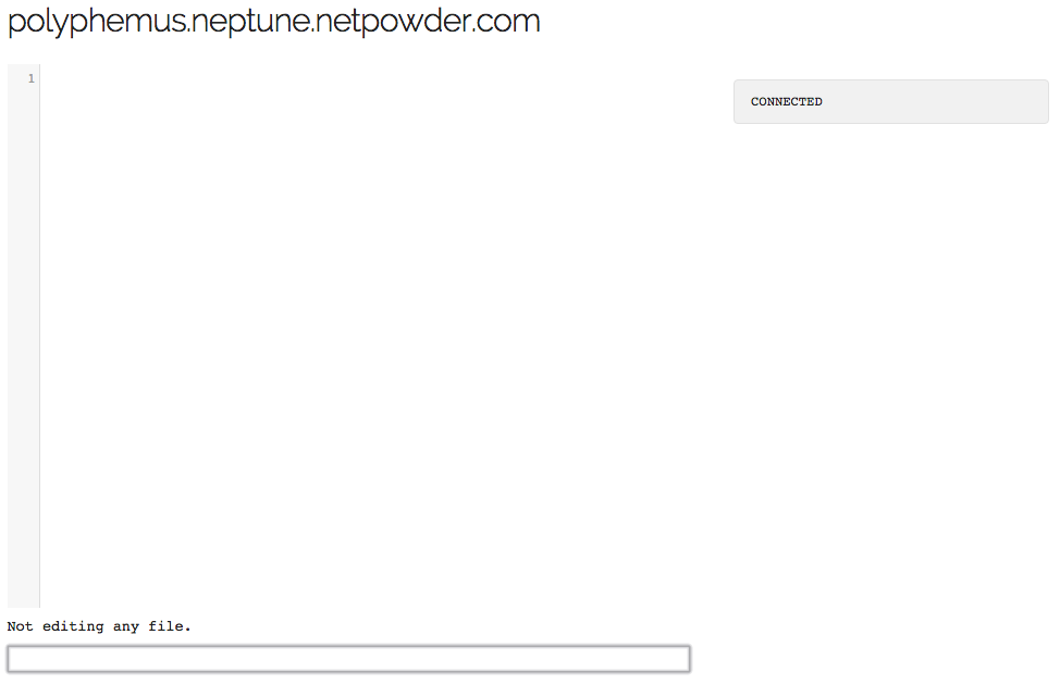
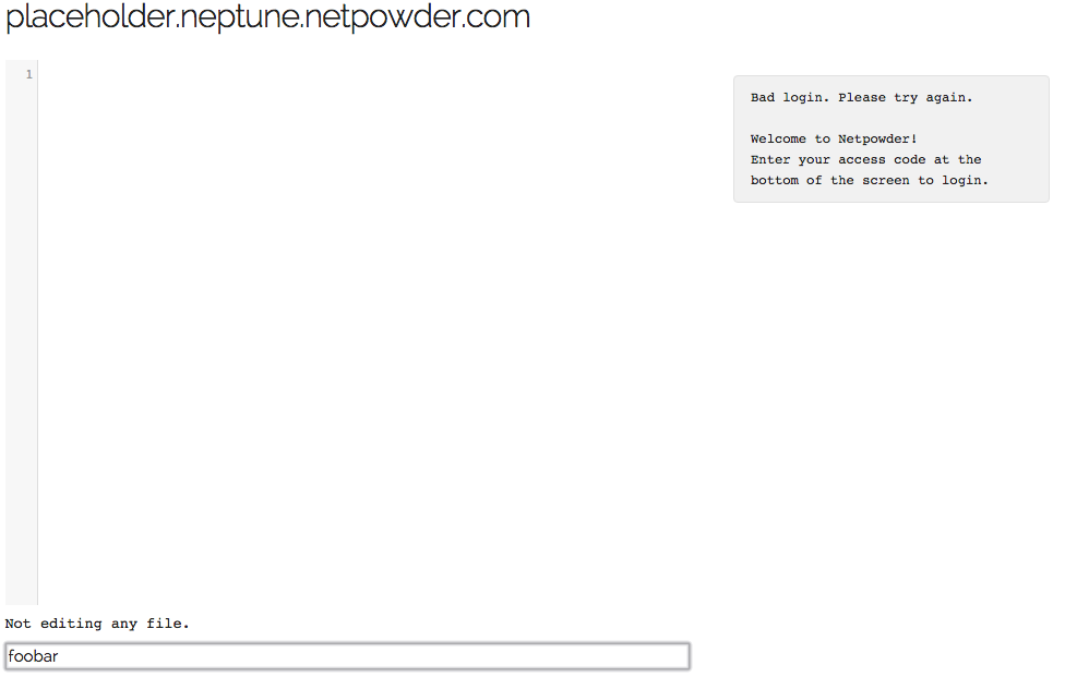
First thing I see. Now what?
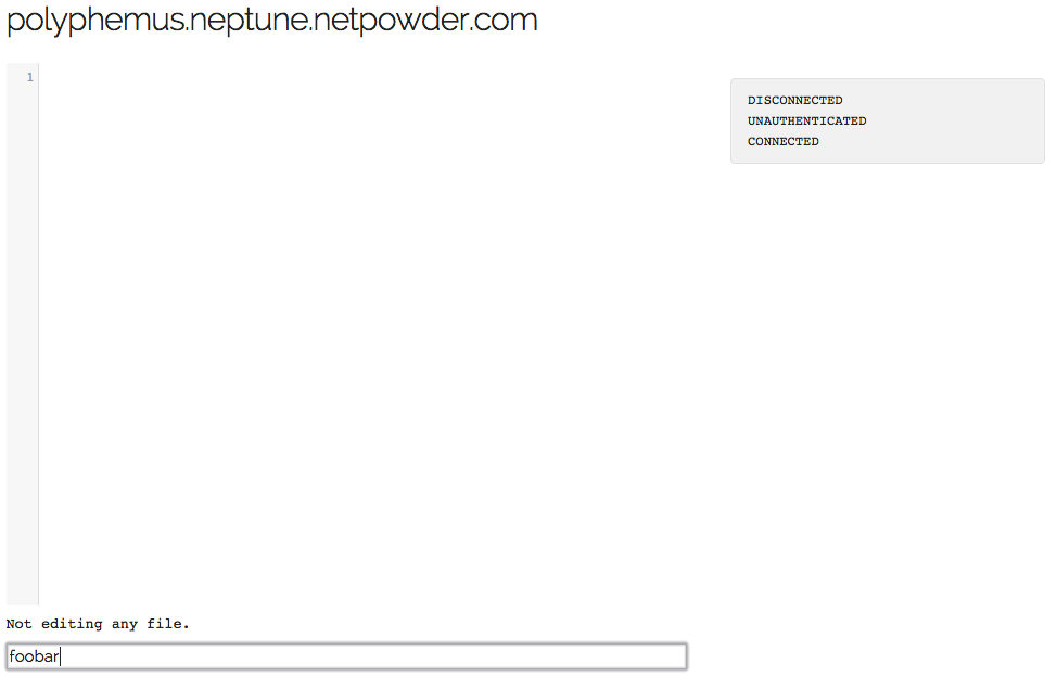
After typing a bad password. Apparently I am disconnected?
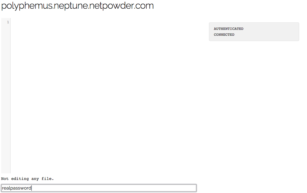
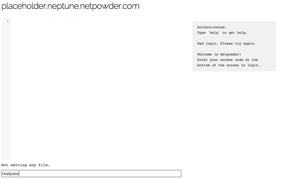
Ok that worked, but still, now what?
Making it better
Let’s try to fix it and turn each of those screens into a positive experience with concrete feedback. First of all, it should tell you that you are supposed to sign in with the access code you have been given.
Much better!
Let’s make the unauthenticated message a bit nicer, and let’s get rid of the disconnect. This requires some changes in the server, but not a lot.
No more unfriendly disconnects, lets try again.
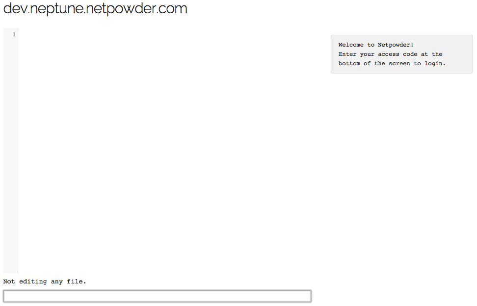
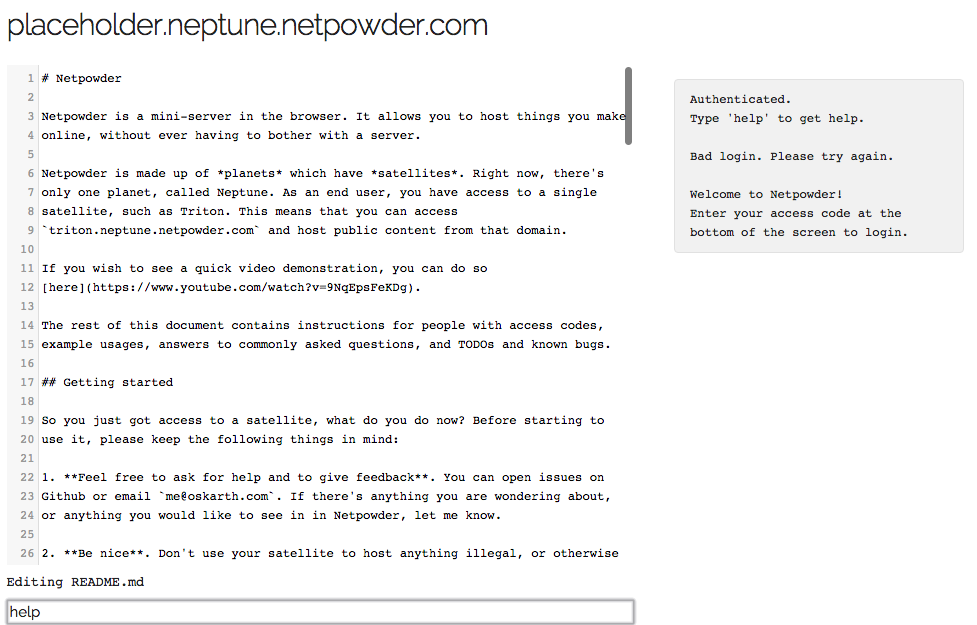
Finally, the message after you login, which points to further help.
Hm, I want some help, I think?
Let’s provide that help message too. Simple using the README file will do for now.
Woah, that’s a lot of text. Oh well, at least I know where to go if I’m stuck.
All in all, some very small changes can make a big difference.
Conclusion
We started off with the general question: what makes a good interface? and, in the face of uncertainty, we drilled down to a trivial but specific example, making some very small changes to make a certain user flow suck less.
This might seem like an obvious thing to do - and it is - but all these details add up. How many sites have you not been to where the flow just doesn’t make any sense? How many error messages have you read which are just nonsensical? All it takes is a little empathy with the end user and attention to the problem.
Commit by commit, for a better user experience.
(If you liked this, you might enjoy Netpowder, a mini-server in the browser.)